Colour Portrait of a Place
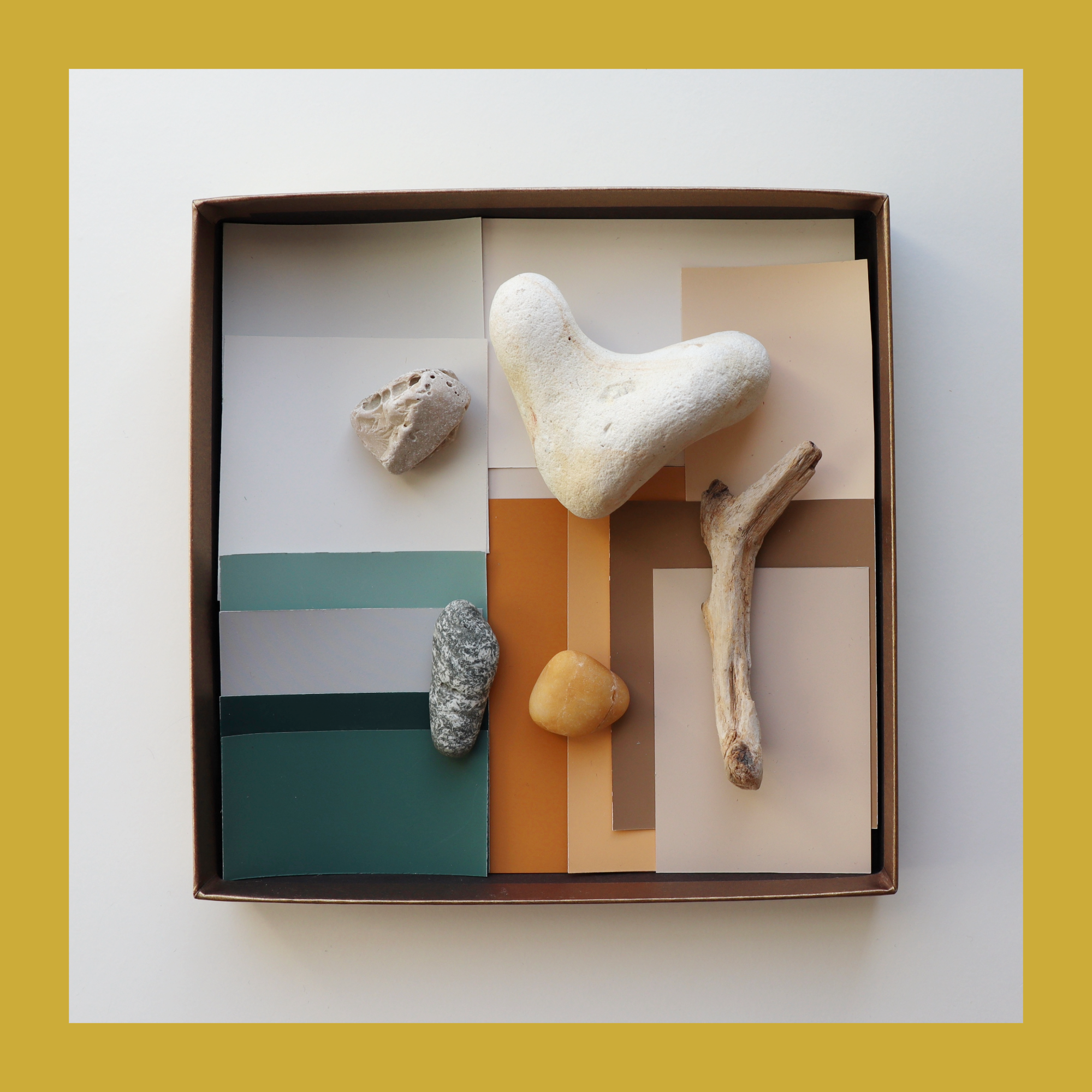
Colour Portrait of a Place
Elements of an impression
When I travel I like collecting materials, pigments, soil samples… they are the elements of an impression of a space, catching colour that is present in that specific place, forming a tangible imprint of that impression and a tool for recreating the experienced atmosphere.
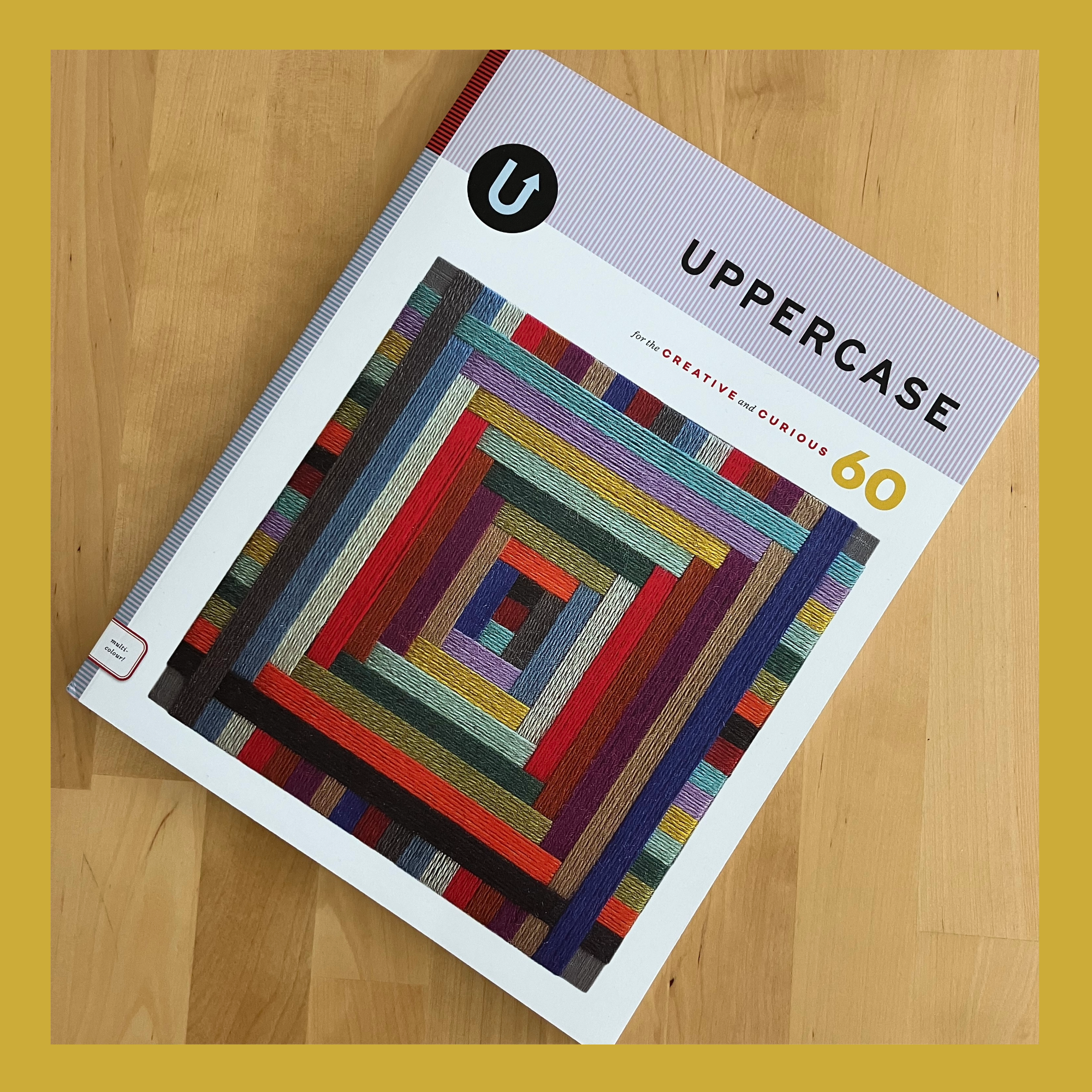
My work was featured in the UPPERCASE magazine, Number 60 (Jan/Feb/Mar 2024), which is dedicated to colour. #60 issue of UPPERCASE is a full celebration of colour and showcases the role of colour in the creative process, through many inspiring examples of colour palettes, colourful projects and art.
I am happy to be featured among so many talented designers and artists.
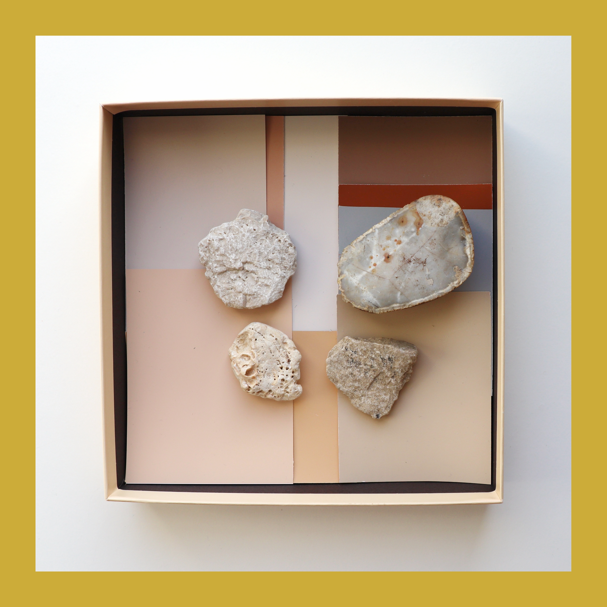
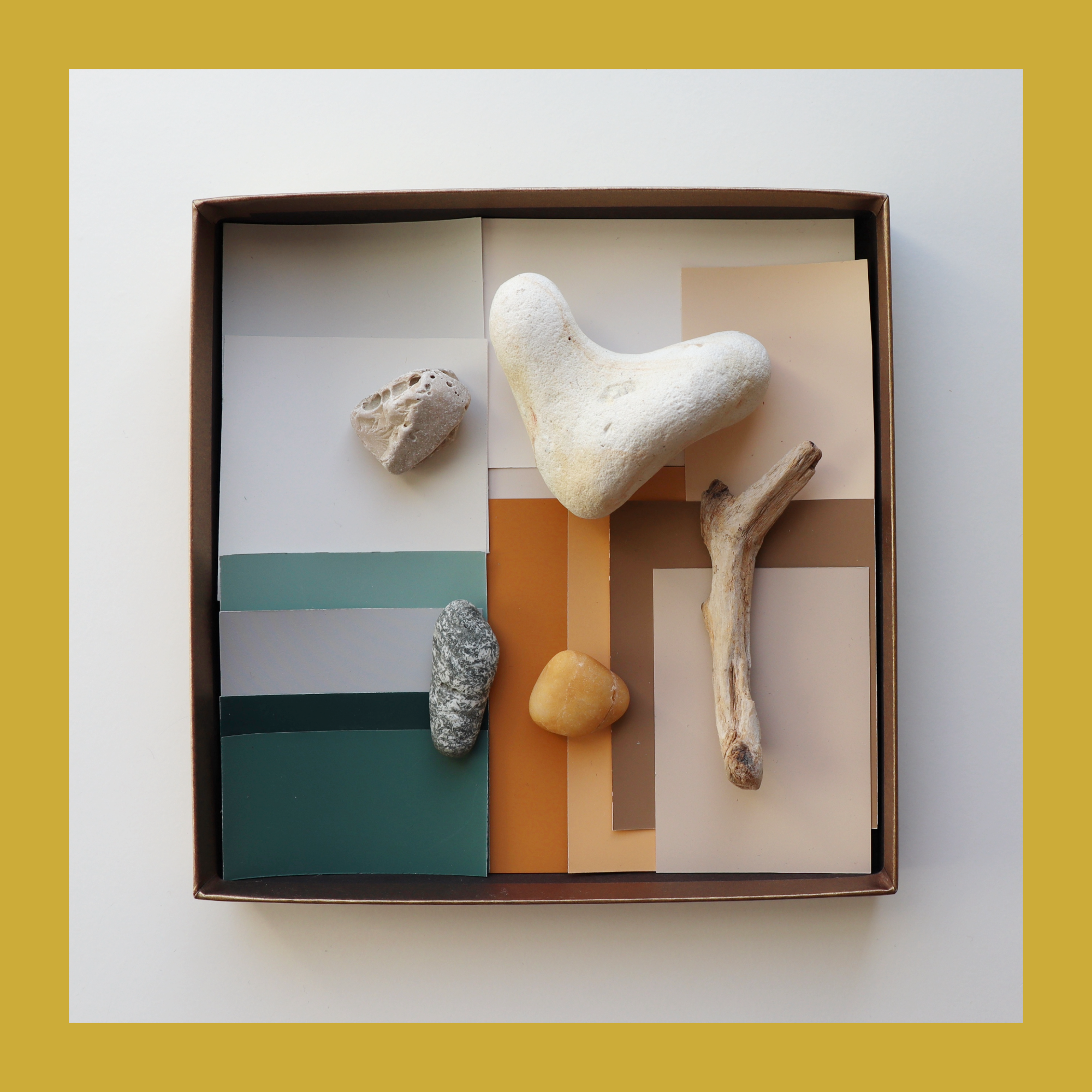
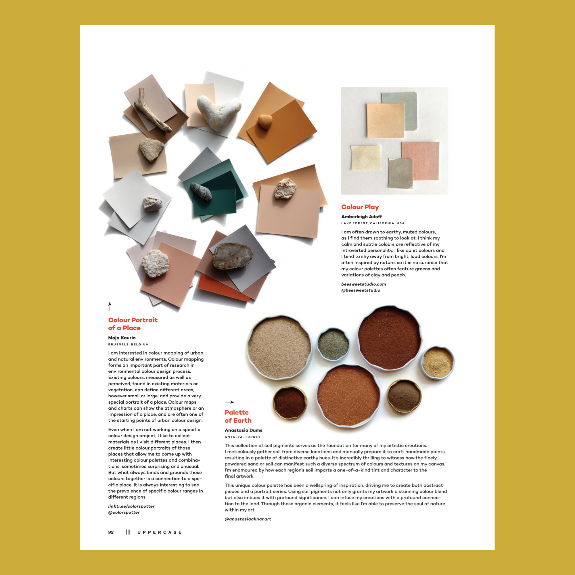
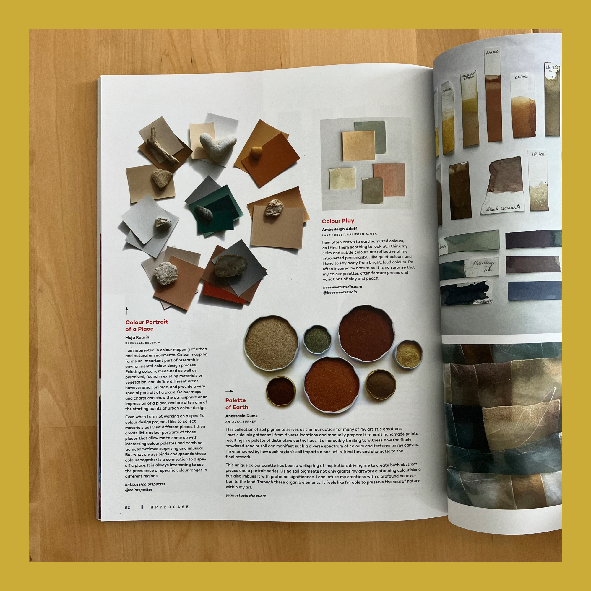
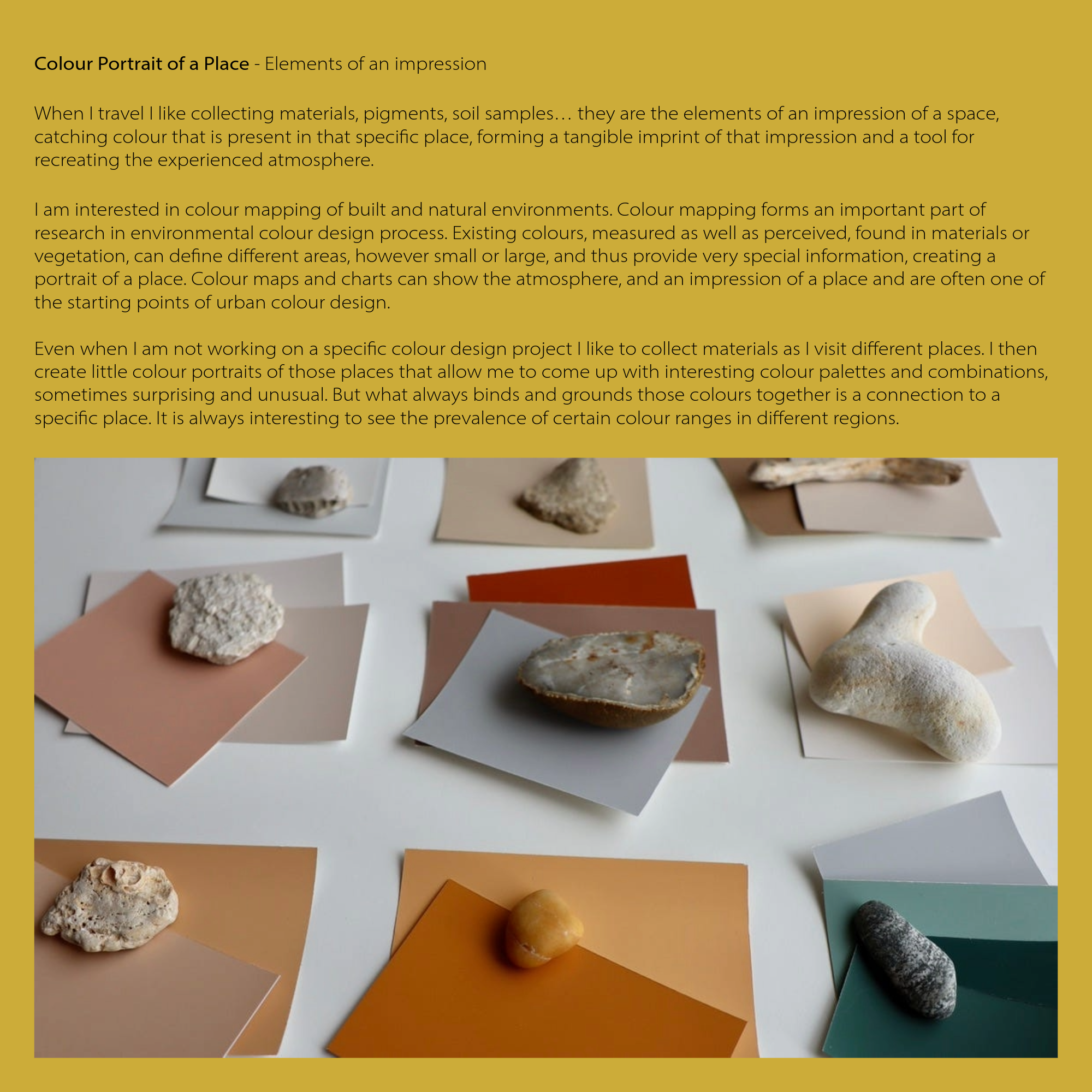
I am interested in colour mapping of built and natural environments. Colour mapping forms an important part of research in environmental colour design process. Existing colours, measured as well as perceived, found in materials or vegetation, can define different areas, however small or large, and thus provide very special information, creating a portrait of a place. Colour maps and charts can show the atmosphere, and an impression of a place and are often one of the starting points of urban colour design.
Even when I am not working on a specific colour design project I like to collect materials as I visit different places. I then create little colour portraits of those places that allow me to come up with interesting colour palettes and combinations, sometimes surprising and unusual. But what always binds and grounds those colours together is a connection to a specific place. It is always interesting to see the prevalence of certain colour ranges in different regions.